Long overdue for a redesign
The last time Justinsomnia went under the knife was 2007, and the web has changed a lot since then. Allow me to impress this upon you with a single image. The graph below represents the percentage of mobile browser traffic to my blog over those last 5 years. Hello iPhone and Android users!
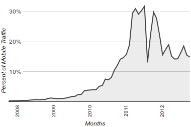
In the span of a single year, mobile traffic jumped from almost nothing to nearly a third of my total traffic (before settling down around 15% this year). Given that there’s now a significant global audience of people browsing the web with smaller screens, I decided it was time to get up to speed on responsive web design. (If you’re in the same boat, I highly recommend checking out Apple’s developer docs on Configuring the Viewport. It was eye-opening.)
So what did I do?
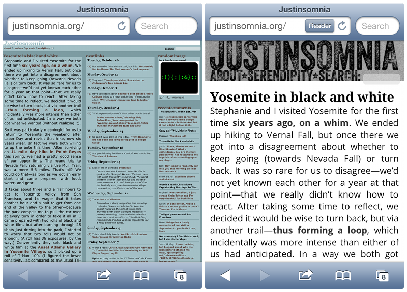
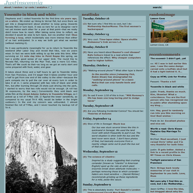
First and foremost, I set out to radically simplify the page layout. I wanted a design that presented my posts and photos in a more professional light, cleaner and unadorned. I settled on a site-wide structure of two equal-sized columns with fixed widths, which would neatly stack on top of each other when viewed on mobile devices. If you’re not currently reading this on a mobile device, you can simulate the effect by resizing your browser to be narrower than the width of the two columns (unless you’re using Internet Explorer version 8 or prior). To contrast the old design vs. the new design on an iPhone, check out this side-by-side screenshot. What a world of difference!
Of course I had to redesign the header, this time with a bold new font (Veneer), a monochromatic color scheme, and design elements that pay homage to technologies that paved the way for today’s social media: letterpress printing and film photography. Given only two columns to work with, I took the boilerplate stuff out of my old third “sidebar” column and stuck it in a new four-column footer (which makes things feel a lot less cluttered). I considered retiring my “neatlinks” linkblog, but in the end I couldn’t bring myself to do it, so I stacked it under the Recent Comments in the right column on the homepage. Speaking of which, I rewrote that plugin to only show the most recent comments from the last 30 days (for maximum freshness) and to show category-specific comments on my category archive pages (e.g. Food). For my monthly archive pages, I wrote a new plugin, Adjacent Archive Links, to add previous and next month links (e.g. October 2010).
My post pages should look pretty familiar. If it ain’t broke, don’t fix it. For the post text and headers, I’m trying out Google Web Fonts (Open Sans and Droid Serif). The biggest change to my posts is a jquery plugin I wrote to paginate the comments when I get more than ten. You may notice that I’ve sprinkled a few navigational links to Older/Newer Posts here and there. I also revised and simplified my about page to take advantage of the two column layout. Behind the scenes, I rewrote every one of my WordPress template files from the ground up, to be more modern, more modular, and to take advantage of all the new semantic HTML5 tags (specifically <article>, <header>, <footer>, <nav>, and <time>).
If you still read blogs in a feedreader, well, you’re probably not reading this sentence there. Here’s why: I’ve always been a vocal advocate of full text feeds, mostly because automatically generated excerpts tend to be so awful that they defeat the purpose of having a feed in the first place. But my opinion has changed after following David Lebovitz’s excellent blog over the last year. He usually syndicates a photo with a paragraph or two, which provides a just-meaty-enough teaser that I get the gist and move on or click through to the post on his site and continue reading. Which is great because his posts can be quite long. So I’m giving this approach a shot using a modified version of mPress Custom Feed Excerpts.
And now, without further ado, let me bid a fond farewell to my digital home of the last 5 years. Forward.
Nice! And you beat me to the redesign season. I’m finally reworking mistersugar.com, which has been with the same design since 2006.
On your About page, the justified columns are adding lots of space between words. Larger font size there?
Looks good in mobile Chrome on my Google Nexus. Mobile first!
Anton, ah justified text! Most of the time it looks ok, or I tweak it until it does. Of course with responsive web design, the text size can very dramatically between devices, so it’s really not worth the energy of manually tweaking that much. Thinking perhaps I should give Hyphenator.js a second look. I’d be curious how it interacts with @media queries.
However, thanks for the heads up, turns out in the design transition, I’d updated my About page in my local dev blog, but completely forgot to copy-paste it over when I updated the theme on the live blog. Fixed and tweaked the text some to make the justified text gaps a little less prominent.
brianr, good to hear. I didn’t have access to an Android smartphone, but I tested it in Chromium on Ubuntu, and figured if it looked ok there, I was probably safe.
Wow different, btw, you need to change your favicon image to match your new scheme.
Looking good!
Dad, actually I did change it, but your browser probably cached it. Hit http://justinsomnia.org/favicon.ico to reload.
My only problem is that when reading it on the iPad the text is only one column and really huge. P.S. Got the new favicon.ico (thanks)
Dad, actually I haven’t tested it on an iPad. What model do you have?
The 1st and 2nd gens only have a 1024×768 display, so if you’re viewing my blog on a display with anything less than 840 pixels (enough room for my two 400px wide columns plus slop for a permanent scrollbar) it flips to single column mode. But I’m curious: what happens if you hold the iPad horizontally? Do you get two columns?
It shouldn’t be an issue on the 3rd/4th generation iPad, which apparently has a 2048×1536 resolution screen (twice as dense PPI).
I’ve got an iPad 3 running Safari w/ only single column mode.
I just discovered that even the though the iPad3&4 have retina displays, they still advertise their device width as 768px, as the physical dimensions of the screen haven’t changed. Since I built my theme to collapse when the device width is below 840px, that affects your iPad. I have not yet figured out how to correctly target iPhones and low-density desktop monitors below 840px without affecting retina-display iPads via CSS3 media queries… Still researching (kinda hard without a device on hand to test with).
What are you using for your lightbox? I like the pop out design it has.
Dan, I’m using a pretty heavily modified (read: simplified) version of FancyBox, a jQuery plugin. I got rid of all the hoo-haa that allows you to click to the previous/next photo. Note: you might also find this blog post I wrote awhile ago useful: How to select all anchor tags that contain image tags with jQuery.
Bah, you and your heavy modifications! :)