Responsive Redesign
I have finally abandoned the 380px-wide column that I chose arbitrarily for my first attempt at a blog design in 2002. That relatively narrow column became fixed when I began embedding photos in my posts, all scaled down to 380px-wide, shortly thereafter. To overcome this limitation, in 2009 I added the ability to enlarge photos using a Lightbox plugin. This meant that I had to manually generate a 380px-wide version and an 800px-wide version of every photo in a post, linking the former to the latter. I attempted a responsive redesign at the end of 2012, but it was really just a hack job. I got things into a place where they sort of worked, but stopped short because I had a new job to focus on. Finally in 2013, I abandoned the 380px-wide “thumbnails” altogether, and just started posting the 800px-wide versions—bandwidth be damned!—allowing the browser to scale the image down to my then-still, 380px-wide column. The benefit being that the newer high pixel density screens in smartphones and tablets showed much crisper images than they had previously.
As it turns out, a new design (or theme in WordPress parlance) is only the beginning. With nearly 13 years of posts, the design is really more of a hypothesis: will it enclose all that diverse content particularly well or consistently? Once I had the basic skeleton of the new design in place, the real work began—which involved clicking through every single blog post I’d ever written—several times over—noting the inconsistencies, writing a script to correct the problems, and ensuring that the script didn’t have any unintended consequences. Not surprisingly the biggest changes had to do with the style of embedded images (which changed over the years, as described above), the inclusion and position of captions (which first appeared above the photos), and the markup denoting updates to posts (which was all over the map).
As you might imagine, this has been a weeks-long process. And yet for some reason, I found it completely captivating. I couldn’t wait to dive back in when I came home from work. Every step of the way, there was some problem to overcome, some new technique to learn. No wall I hit seemed insurmountable. I didn’t want to stop until I was completely satisfied with every aspect of the design and implementation.
One side-effect of forcing myself to look back over more than a decade of blog posts was the realization that not everything I posted back then has aged particularly well. This is to be expected. Not only have I grown and evolved over the years, but the way I blogged in the past was more akin to how people use Facebook today—posting missives intended for friends and family, not posterity. These days I see my blog more as a place to post about the larger events, trips, and projects that are happening in my life—sort of a cross between a portfolio and a scrapbook. Though I’ve long been a staunch proponent of not self-censoring old content, I may start “unpublishing” some old posts that I feel have little or no redeeming value, besides being cringe-worthy indicators of where I was at the time.
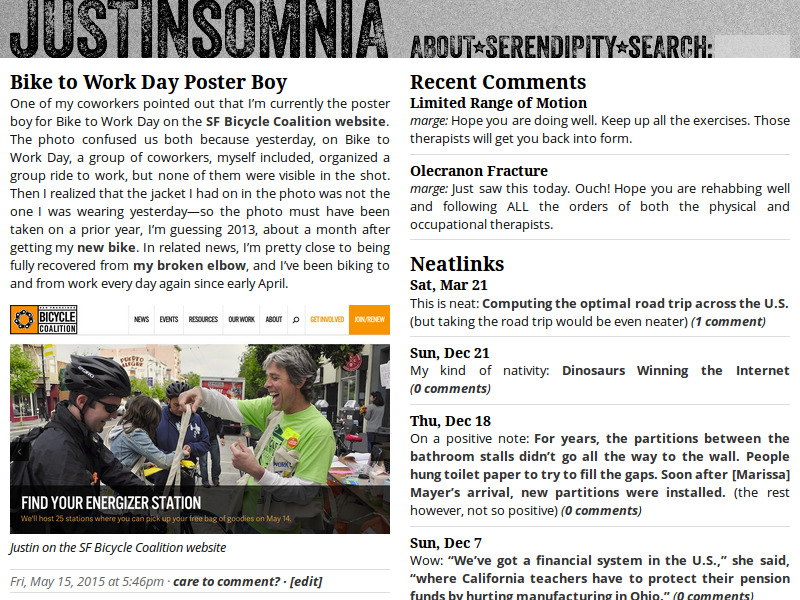
So that’s the update. Feel free to look under the hood and kick the tires. Let me know if anything doesn’t look quite right on your device of choice. And as is the tradition, I’ll close with a screenshot of my blog as it once was.

It is really simplified down and minimalist with a new wordmark to freshen it up and there isnt even a hamburger menu (I am viewing on mobile). The images look good, I can zoom in with my fingers. Though I wonder how one of your panorama will do on the mobile platform?
Katie, thanks for the comment. Yep, no hamburgers were harmed in the making of this new design. I tried to keep things as simple (read: menu-less) as possible. You can check out one of my panorama image posts here: Twilight panorama of San Francisco. It works pretty well for me on Android and desktop (Firefox and Chrome). I’ll check it out on Stephanie’s iPhone 5.
Note: I fixed a bug that was causing my blog name to overlap with the search box on iOS Safari (iPhone 4 and 5).
Hi Justin,
The only thing I see missing in your new design is the “sidebar”. On many responsive designs it’s not a sidebar anymore, but the content that used to be in the sidebar is moved to the footer. Have you thought about that?
The reason I mention is, mainly, because now you’re not showing anymore the neatlinks. They are probably superseded by Twitter now (I also used to have “miniposts” in my blog for that too), but I’m still not convinced that the right way to go is to post everything in Twitter or Facebook. Any thoughts about that?
Xavi, I decided it just wasn’t that important to me to maintain a sidebar/footer with a lot of boilerplate content. I was inspired by the design trend I’ve seen recently where the content stands on its own, without too much window-dressing. As far as neatlinks, you’re right, in the age of Twitter and Facebook, it’s not clear to me that just posting a link really adds much value on my blog any more (except purely as an archive to which I can refer back). However, they are all still here, sequestered in their own category—as you page back through the posts, you’ll see them in between the posts, just little one- or two-line “asides” without titles.
Whoa… had to do a double-take! Nice, clean, but yes, some navigation might be nice to drive clicks if I’ve not visited for a while…
Oh, I’m not too worried about “driving clicks” these days.
Gotta just remind myself to to visit my feedreader, then… :-)
Justin: The content looks great on my iPad. Nice work!
Phill, great, glad to hear it.