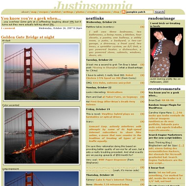
No AJAX was harmed in the making of this design
My goodness, it’s been two years since I last shook things up here at Justinsomnia Industries. For two years, dear reader, you’ve suffered that indescribable background color, affectionately known as #ddddaa. Much more likely, you passed those many months by reading from the comfort of your warm, cozy feedreader.
Well out with the old and in with the new. Justinsomnia‘s going blue. It’s time to Shift+Reload your browsers.
I’m sticking with the three column InformationOverload™ design, but hopefully the darker page background with the lighter post background will soothe your fried retinas.
Jason Kottke‘s blog layout inspired the new minimalist header bar, and I dropped all that magical CSS that allowed the site to resize horizontally in some browsers. That allowed me to tweak some nitpicky alignment issues that’d been bugging me since I finally grokked the box model. Now the text width is the same width as the images.
And no blog redesign would be worth blogging about without some new features right? Less is more bedamned! And I’ve got some doozies. Two to be exact.
First, site-specific Google searches (using the search box in the upper right) now appear in the the style of my blog. That’s something I’ve wanted for ages. It’s SO awesome, I stayed up still 2am last night tweaking it.
And second, I installed Rob Marsh’s uber-cool Similar Posts plugin for WordPress which is dynamically generating a list of 5 related posts at the bottom of every permalink page. It’s surprisingly effective, and a totally addictive way to cruise my 5+ years of archives.
Of course there’s countless other changes here and there. I (re)categorized most of my old posts, and exposed links to the category archives at the bottom of each post. And last but not least, I’ve finally got a 404 page, which will generate a potentially helpful search link if you mistype the URL, e.g.
http://justinsomnia.org/2007/10/hiking-the-bryce-figuree-8/
And that’s all folks. All I can remember.

I hate change!!!!
what a shock and I was just getting used to the change in design that you made last year.
I like the blue… I like blue always… but I miss the header… not the last one the one before the last one… how about a blue version with that header.
and then never change again!!!!
Blue! Blue! Blue! Carolina Blue! :)
where’s the contrast nob?
let me second the vote to return to old design…
anon/anon2, umm, thanks for the feedback, but I think change is healthy. in the very least is forces us to challenge our aesthetic comfort zone.
corey, more contrast? is anything too difficult to see?
just gave the header a little tweak to give a little more design continuity. thoughts?
The above should be a cramped box with no padding – but I think I made my point.
ekbworldwide, what do you mean no padding? each of my posts has 6 whole pixels of padding on all sides, and 18 pixels of padding between columns.
but seriously, thanks for comparing my blog to a novel, i take that as a compliment—but my ongoing design evolution really owes more to newspapers than books.
that said, I don’t necessarily feel like hypertext media should be limited by designs borne out of the physical world.
In general, I prefer blue to yellow. Good change!
joy, thanks.
i updated the logo again, same font as before, different size, alignment. also added the comment count link in place of the category links at the bottom of each post on the homepage. also tweaked the brown color of the links to make it a little “browner.” all suggestions from my brother.
Is the font bigger? I like that too.
nope font size is the same.
I moved the relatedposts box up above the comments column and added the previous/next links (that used to collide with the post title) to the top of that box.
I like the return of the ‘Justinsomnia’ logo to the top and dig the smaller header. Nice to see the relatedposts at the top. Maybe the fonts could be bumped up a px or two.
Change is good!
Last comment about your new weblog design. You are losing the bottom of the characters in your post headings. For example, you can’t see the the bottom of the “g” in the word “design”. Everything looks good otherwise. Can’t wait to see you during Christmas break.
Matthew, unfortunately that’s a bug in Internet Explorer that I don’t have much control over. It doesn’t look that way in Firefox, though…
Oh, and keep the comments coming. I love the feedback :)
good to see the old top logo returned… reminds me of the old times…. ooohh those good ole times… but on a serious note I do find that the background of the logo being white is a bit of an annoying clash from the rest of the colour scheme… maybe you is happy to have it clashing but if so then maybe it would be help by having a bit more white, blank space (thinking space) above it. Just a thought otherwise I am slowly getting used to the change.