Letterpress
It all started in Santa Fe.
Maybe it was that I had just moved my blog from Blogger to WordPress, a blogging platform in the company of Movable Type, both of which have names evocative of earlier printing technology.
It also may have been the fact that in moving from North Carolina to California, I was going to be working for an actual publishing company, one that produces physical books, though I’d be part of their online publishing group.
In any event, the universe was seeming to say, look into this. The funny thing is that it took so long. I’m not sure what the impetus, but last October I found myself looking at printing presses on eBay when I discovered the San Francisco Center for the Book. Sounds almost quaint in the age of the internet, doesn’t it?
Much to my delight, they offered classes. Unfortunately all the intro letterpress ones were booked through the end of the year, so I got myself on the mailing list and eventually squeezed into a class that was held this past Saturday.
I have to say, it was phenomenal. Other than having to wake at 7 on a Saturday to get to the city by 9, I can’t express how excellent it was. I felt like I was completely transported out of my life for a single day.
The instructor, Mary Laird, was a charming and loquacious woman with her own small press in Berkeley. She demonstrated small book binding, explained type and type sizes (em’s and en’s, points and picas!), as well as leading and spacing. Over the course of the day we were going to create a book (!) and print enough copies for each of us to take 5 home.
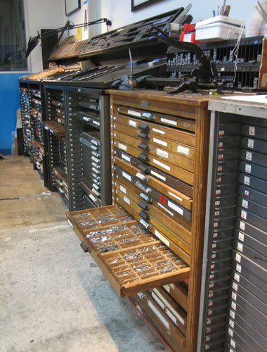
Here’s what type looks like. Each of those drawers contains one typeface, in one point size, in one style. Like Garamond 18pt Italic. One whole drawer, just for that.
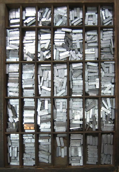
Inside the drawer, the type for a small font looks like this:
Type for a larger font:
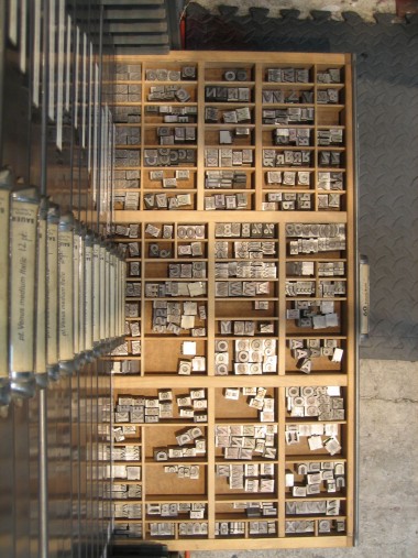
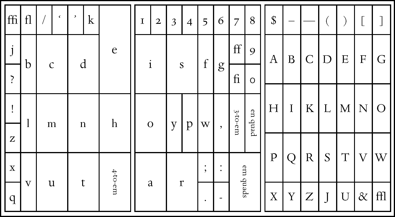
And that’s just the capital letters. The type is layed out according to frequency, so there are lots of e’s and not too many j’s. They’re arranged according to a standard called the “California job case” which I thought at the time was something unique to California, but now I’m assuming was probably a de facto national standard. Think of it as QWERTY for the post-Gutenberg era.
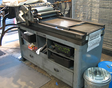
And here’s the press we were going to be printing on, a Vandercook 4.
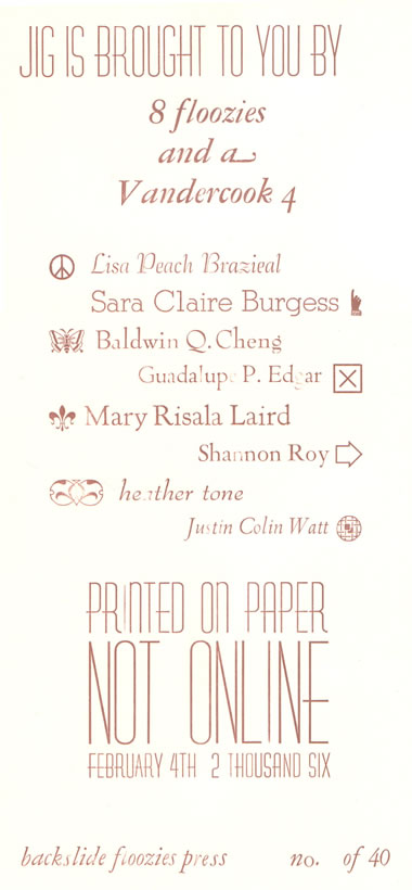
So the project for the day was to produce a book as group. Two people would work on the cover. Two on the title and the half title page. One on the text page. And two on the colophon. I ended up working on the colophon, with a woman from Peachpit, a competitor of O’Reilly’s.
Together we came up with a rough design for the page, which would include everyone’s names (we’d all already spelled out our names individually) plus any other text or dingbats we wanted. This photo shows my composing stick with 72 and 36pt Huxley type spelling out “NOT ONLINE” and “PRINTED ON PAPER”—a jibe at both of our high tech backgrounds.
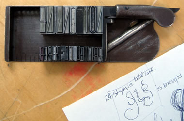
Notice all the letters are mirror images, and they get spelled out from right to left. Not easy. Especially when they like to tip over.
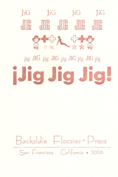
Meanwhile one of the other groups was getting ready to print the covers, a decorative design they created that spelled out the title we’d voted on: “Jig”.
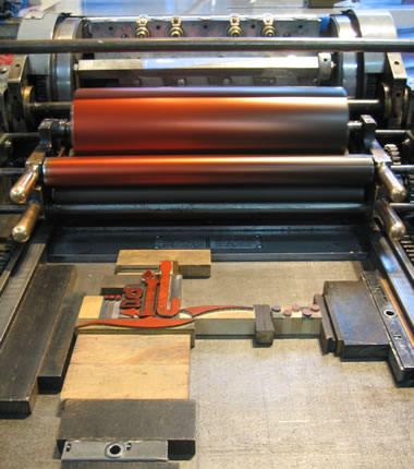
And here’s the first cover, “hot” off the press:
You can see that we applied two different inks to the rollers, a dark red-orange and a brown just for fun. It ended up giving each page of the book a subtly different color.
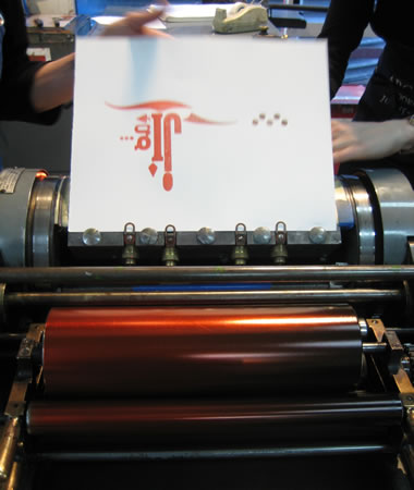
After that we printed the title page and the text page. Check out all the “typos” I caught:
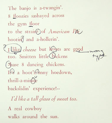
As you can see, on a printing press the typos tend to come from upside down type, 0’s and o’s (zeros and oh’s) getting mixed up in the type box, and b’s and d’s and p’s and q’s getting mixed up. You’ll notice in two places it occured to me that we should use a real “fl” ligature.
A note on the text: we each contributed one line of text on the theme of hoot’n’anny, which the resident poet, a recent grad with an MFA in poetry, wove into a poem of sorts.
So we printed the rest of the pages, everyone did their 5, and then we cleaned up. All the different type had to be put back into the right type drawers, for the right typeface, size, and style. Luckily we kept notes, but still it required the California job case cheat sheet by our sides at all times.
After all the type was put away and the press had been cleaned, I gathered my freshly printed book pieces and left the center a little after 6:30pm. I scanned in each page of the book for your viewing pleasure.
Note: These photos originally appeared in my photo galleries.
S O C O O L !!!!!!
I am beyond jealous.
That is cool. I worked at a university press in VA that had these kinds of presses. No one ever sent a job thru them cause of time. But it was so great to learn about ‘furniture’ (all those little pieces of wood that hold the type together) and mixing all the inks. Wouldn’t it be great to slow your life down and work on with these machines all the time?
Neat-o! It reminds me of using the mimeograph at my elementary school (no, I’m not that old, the school was WAY behind).
Thanks very much for this account of the day and the process. What a cool class!
What a blast! I hope you got your hands all full of ink and that you realized you need to keep exploring your creative non-technical being.
Justin, this is an awesome post. Thanks for the history lesson. There was an excellent New Yorker profile a few weeks back about a Dutch font designer, with mentions of the printing press. I’ll send it to you via e-mail.
Wow!
I added some scans of the book’s pages to the bottom of the post and the photo gallery.
I actually learned this type of printing in high school (yes, I am that old). The printing presses were of a more primitive design. For the manual model, the type block was locked in one side of a clamshell, in a near vertical position. The paper was placed against some guides on the other side of the clamshell. When the actuation lever was pulled, a roller came down, inked the type, then retracted out of the way by the time the two clamshell halves came together.
There was an “automatic” version of the press, too. The only difference was that the lever was replaced with a motor. Once this beast was set in motion, you had to reach in the clamshell as it was opening to remove the printed sheet and add a blank one. The time for each close-open cycle was on the order of 2, maybe 3 seconds, so you had to move fast to avoid getting your hands caught in the press. It actually didn’t take long to get into the rhythm, though.
[…] Today, via Make, I found a posting by a new employee of O’Reilly who took a class at the San Francisco Center for the Book on letterpress, producing their own book on a top-line proof-press. The work of a letterpress is antiquated and raw. It is, after all, the same technique that Gutenberg used to print the first movable-type. The principles are simple, but the execution requires a certain blend of artistic talent and engineering skill. […]
Wow, this is the coolest thing ever! I’m super jealous.
Wow, that brings back memories of when I learned to use a Mergenthaler Linotype and a Chandler-Price power press back in High School. Kids can’t do that these days, the insurance agent for the school’d wet herself… Neat set-up for the cover, too!
Thanks for the comments yall, and hello to all the people stopping by from Make. I wanted to add that I continued musing on the letterpress experience in another post: Reclaiming obsolete technology for art.
Chris and John, I’d heard (from my dad) that there used to be printshop classes in high school, which I imagine were later replaced with typing and then computer classes. Of course my mom complained that she wasn’t allowed to take the printshop classes, she had to take home economics.
Wow, that’s so cool. I wish I had time to take that up. I adored printmaking when I was an art student in undergrad, and always did wonder about adding text in. Really, I just want my own press. After tenure, maybe… :-)
I thought it would be cool to have my own little press at home on my desk (like I have the room!). Then I decided it might be easier and a little more sustainable to just take some classes. Which reminds me, I need to sign up for Letterpress II.
Hell, I do this sort of stuff for a living, and I’m jealous of your day! Looks like a great workshop. And I covet those woodtype ornaments…
Ampersand, I’m so glad you enjoyed. You remind me that I need to get down there to take the next letterpress class.
Both my husband and I took printshop in junior high school in Detroit. Our teacher was Mr. Weeks. Remember justifying the type, checking it with a reflective device? I even remember being chosen as a Editor, to go around and check the other students’ work. I also had to take home economics, where we made cocoa – from scratch, while my husband went on to wood shop to make a set of bookends.
I love the pictures! Anytime I can see how another letterpress studio is set up is great. I happened on a studio full of letterpress equipment by chance and it has been fun ever since!
Its great to see more people putting down the mouse to try this tactile art of handsetting type and letterpress printing. I have examples of my work at http://www.itsfancy.com or http://www.thedefianceproject.com.
Cody
It’s Fancy Letterpress Studio
i cant believe how life would be with out a printing stuff up .
[…] I just stumbled across this old-ish report of an intro letterpress class at the San Francisco Center for the Book via the MAKE blog. […]
Justin! Thanks for the great website. I teach printing and the Academy and your pictures are perfect for showing what letterpress is to my students. Thanks again! I’d love to take them on a tour at the SF Center for the Book!
A great informative letterpress overview! (Roaming Justin’s online world is a pleasure. I want an upside down tomato grower.) Please turn the composing stick photo so it is the way one is to hold it (or place on a surface) while using it. Logically the retaining edge is at the base as you hold it and at the head of the first line of type. Type is less likely to fall out if you use leads and slugs starting with a measure slug before you set anything. Type should be set as you read left to right (and it will be upside down).
The SFCB is a wonderful resource; I’ve taken a few classes myself. I believe Mary Laird used to teach at San Francisco State; maybe she still does. (Over 65? I think you can take classes for free! at SF State)
City College San Francisco has a 6 1/2 hour, 8 session letterpress printing class that is a wonderful basis for a broad and in depth understanding of letterpress and it has an extensive collection of wood and metal type. Starting this spring CCSF will again have a bookarts class. Visiting this blog will be a great overview to use for students trying to explain what they are studying.
Letterpress is HOT right now so anyone wanting to take a class anywhere plan way ahead of time; classes fill up early. Thankyou for increasing exposure to letterpress from a dedicated hobby printer.
Lee, many thanks for the comment. In the time since I took the class last year, I’ve moved to San Francisco, and this reminds me that I should get back down to the Center for the Book, now that I can practically walk (or bus). Might also have to check into that class at City College, it sounds great.
Thank you for this blog listing of your experience. We have a Printing & Book Arts Center here in Rochester NY that opened this past year. It has been a great success with classes in letterpress, bookbinding and papermaking. The idea of a book in a day project is a good one that we may emulate. Check out our website at http://www.geneseearts.org
Letterpress really is the best, printing process that is. It allows all of us to create in an industrial art form. Nothing like the snug fit of a nicely justified line, the hissing of an over inked beautifully oiled #3, #4, or an Universal 1 and 3 the Big boy)Vandercooks, and the crushing of fibers as my 36Pt Kennerly meets the 80# cover.
It’s great you got a chance to experience a world without spell checker. I’m the director at the Printing and Book Arts Center in Rochester, NY and I get Play everyday with over 1K fonts all the above mentioned vandercooks and we just got a Thompson Typecaster and tons of mats. I must admit our space has a great vibe, alot better than my garage.
Sorry for the ramble. Mitch.
Emory Walker is so overlooked historicaly. He really is a great example of someone really taking on the chin and getting back up and succeeding. He is worth getting to know. Google him
Nice site! I came across it while researching a book I am writing. Having been in the printing industry for over thirty years its great to see that people out there still take great delight in a format that was the world standard for printing for over six hundred years!
my fondest memory of the California job case—-was dropping it on the floor in my 7th grade printing class—my worst memory of the California job case was: in being told by mr. erminovicks–that i would have to pick up all the type and place it properly back —–it took a long time to do….my advice–do not drop the California job case, if you have a world series game to watch
p.s. my step-grandmother was an executive secretary for mergenthaler–both at the new york headquarters and also the bethpage plainview headquarters——in new york–meeting people in all aspects of publications in print–newspapers-books-etc etc……
Lovely pictures indeed. I worked for the oldest Press in the world – Cambridge University Press here in England printing books and bibles (litho) before redundancy in 2008 and having been a printer for thirty two years.
Wish I’d kept some of the letterpress type we threw out in the 1980’s though!
I lived with my grandparents as a child, and grew up with my grandfather’s letterpress printing office in my back yard. My grandfather’s father had been the editor of several newspapers, so my grandfather grew up knowing the printing business inside out. Inside the office, he had a linotype machine, two Kluge presses, one hand fed and one automated, an Elrod strip machine, a guillotine paper cutter, a stapling machine, and a composition area. From the time I was 3 years old until I was 14, I spent all my time in his office, watching him set type, feed the presses, and run strips. I stood on the back of the linotype machine, watching the mats fall back into the magazine, and listening to the wonderful sounds the linotype machine and the automated press made when they were both running together. I watched him compose by hand. I still have many of his blocks and quoins, and a few lines of type (with my name on them), from his linotype machine. The amazing thing about my grandfather was that he was legally blind. One eye was completely blind because of a detached retina, and the other was very blurry because of cornea trouble (he had many transplants, none successful.) He knew the business so well that he was still able to print, repair and maintain all his machines, and run a successful business. My grandmother and I proof read for him. I wish, so much, that I could go back in time and watch him print once again. He will always be a hero in my eyes.
To put the above comment in perspective, I am a 72 years old lady, so the year was 1950 when I first started watching my grandfather print. I watched him until about 1961, when his eyesight got so bad he gave up printing. His linotype machine was a Mergenthaler Model 5, including 2 full magazines. His Elrod strip machine had 8 molds. He had a flat casting box which was 12 x 18. I have pictures of my grandfather and his father in their printing office in the early 1900s, when my great grandfather was the editor of several small newspapers in the area. My grandfather’s sister ran her own newspaper in a small town, and had a linotype machine exactly like my grandfather’s. My grandfather’s oldest daughter, my aunt, made her living as a linotype operator for a large newspaper, until offset took over. Other memories of my grandfather’s printing office include watching him put pigs in the crucibles. He had 2 crucibles, one on the strip machine and the other on the linotype machine, and he had the pigs suspended so they would slowly melt. I also remember all the little lead shavings that were all over the floor of the printing office. What a wonderful place to grow up!