Reading is a joy with Gmail, writing not so much
Since moving to California two months ago, I began using my Gmail account for personal correspondence, and I’ve come to two conclusions.
Reading email with Gmail is a joy
It groups back and forth emails into single conversations—solving, in my opinion, the email overload problem. It searches my email in a heartbeat. Even the act of adding labels or using the star feature seems unnecessary in the face of full text search. I must admit, though, that the omission of a “trash” button does come across as a heavy-handed attempt at behavior modification. Hello Gmail Delete Button.
Writing email with Gmail is not a joy
Recently I’ve noticed I have a very subtle distaste when it comes to responding to email. As a result, email that I should enjoy replying to remains unanswered in my inbox for intervals longer than I’d prefer. I think part of the reason for this is Gmail’s user-interface.
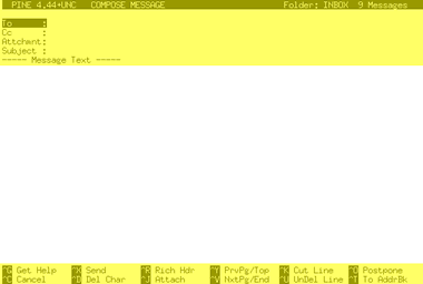
Prior to switching over to Gmail, I checked and wrote all my email using Pine running on a university server via SSH. Here’s a screenshot of the Pine interface.

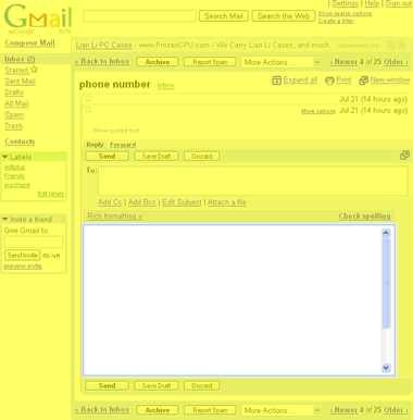
The yellow highlighting is intended to demonstrate the relative area of the composition space as compared to the rest of the user-interface. Now take a look at the Gmail interface (which I’ve edited only to remove personally identifying information).

Many of us spend a good deal of our lives in HTML textareas, but what struck me is how “cluttered” or loaded up the Gmail interface is, as compared to Pine. I think for this reason, my enjoyment in responding to emails within that tiny textarea surrounded by so much clutter is considerably diminished.
And I’m not even touching the scrollbar next to scrollbar usability snafu—other than to say the Gmail team might be best served to create an interface that never triggers the browser’s vertical scrollbar (a la Google Maps).
I must say though, worst of all, my beloved resizeable textarea extension does not operate on textareas that have been manipulated with JavaScript. So I can’t even resize my email writing space.
DORK! dorkity dork dork dork.
(disclaimer: i’m a little tipsy, and i must admit that i, too, could easily to called a dorkity dork dork. so pot, this is kettle. and you’re black.)
ps, i (we) miss you dearly and would really like to hang out sometime. except you’re in california. for shame.
I agree the GMail textarea could be bigger (and more functional), and they really need a link to your addressbook but I love having the conversation I’m replying to still available while I’m typing. Oh, and the javascript spellcheck is way cool.
ok, on a more sober note…
the thing that bothers me about pine (and all other terminal-based text editors) is that moving around in a large block of text requires too much arrow-buttoning; it’s so much easier to use the mouse to cursor around and select stuff
gmail’s textarea is sort of skinny, but there’s a break-out link that opens a new window with the same information in your pine window (though for some reason the textarea is still skinny)
and while it is sort of annoying that you can’t get to the contacts without opening a new gmail window, have you noticed that if you just start typing someone’s name in the to: field it will axaxify a list of people’s emails who match what you’re typing? i love that to no end. who needs contacts when gmail will search every email you’ve ever written for the person’s name? ok, maybe to get non-email information like addresses but still.
You know there is a “trash action” in the “more actions” dialog box just above your inbox. Check the emails you want trashed…and click “move to trash” in the dialog box and they are gone.
“but there’s a break-out link that opens a new window…”
oh snap. i knew that but forgot that. i may start using that from now on.
and yes dave, i know there’s move to trash under the drop down box, but that requires more precise mousing to select than just a button click…
Right now, I like my gmail account because it’s not signed up for anything that would inadvertently get spam sent to me (unlike my weareleft account which gets at least 100 spams a day). I did notice that the trash button issue was a bit annoying, however, in some ways it’s nice because I won’t just accidentally trash something I want.