Learning how to save, nineteen years later
At the end of every month I record the balance of our retirement and brokerage accounts in a spreadsheet. At some point, after having maintained this practice for several years, I created a separate spreadsheet with the combined total across our accounts taken from the end of each year. I use this data to generate a simple graph that shows the change in value of our investments over time.
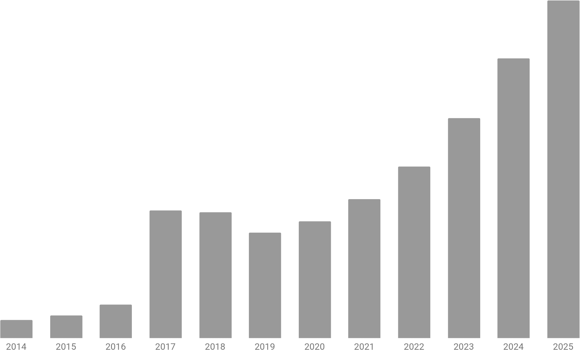
I can clearly see the impact of selling our San Francisco condo in 2017, followed by buying our Fresno house in 2019, but it’s hard to see any impact from selling the house in 2022, let alone having almost no income during our time in Fresno. I couldn’t help but wonder how much of each year’s value is due to the contributions we’ve made to our various accounts and how much is due to the growth of those investments, i.e. reinvested dividends and market appreciation? It seemed like such a simple task until I reached a year with a negative contribution amount (e.g., in order to fund the purchase and renovation of our house in Fresno, we withdrew far more from our brokerage accounts than we contributed to our retirement accounts). I decided I needed better data. So I created a new spreadsheet. For every year for each of our accounts, I would record the starting value (i.e., the ending value from the year prior), deposits (i.e., contributions including incoming rollovers/conversions), withdrawals (including outgoing rollovers/conversions, fees, tax withholdings), dividends and interest, and appreciation or depreciation. Summing these 5 values should (read: must) yield the ending value of that account for that year.
My first task involved downloading all of the December statements across all of our accounts going back as far as possible. Conveniently Schwab maintains account statements for 10 years; I’m kicking myself for not downloading the statements from years earlier. I had also neglected to download any statements for our various and long-since-rolled-over 401(k)s, so I had to make do with my sparse spreadsheet records. For the most part I had the annual contribution values (including company match) and annual account balances, but I did discover a few instances where I only recorded the 401(k) account balance at the time of rollover. I was able to reverse-engineer the missing data in a few cases (thanks in no small part to the little breadcrumbs I’ve left for myself in these posts), but I also had to make peace with the fact that some details (most from well before 2015) have been lost in the sands of time.
Once the data was entered and verified, I summed the values across our accounts for each year, reformatted these totals as a summary table with one row per year, and then added two calculated columns: net contribution (i.e., deposits less withdrawals) and net growth (i.e., dividends and interest plus appreciation or depreciation). At this point I found myself right back where I started, unsure of how to handle the occasional negative value that I’d calculated against the always positive annual balance.
I looked back at the graph above. The total height of each column represents the ending value of our accounts for that year. Thus each subsequent year represents whatever transpired during that year together with the balance from the previous year. That was my a-ha moment! I had been taking for granted the fact that the annual balance is a running value, whereas the net contribution is a year-to-date value. In other words, I’d been trying to compare apples to oranges. What if I created a running net contribution value? That turned out to be the missing link. It never occurred to me to treat our contributions and withdrawals cumulatively, I think because that data isn’t consistently reported that way anywhere else. Once I calculated the running net contribution value for each year, I was able to pull back the curtain on the graph above in order to finally see the impact of growth on our contributions over time. Wow!
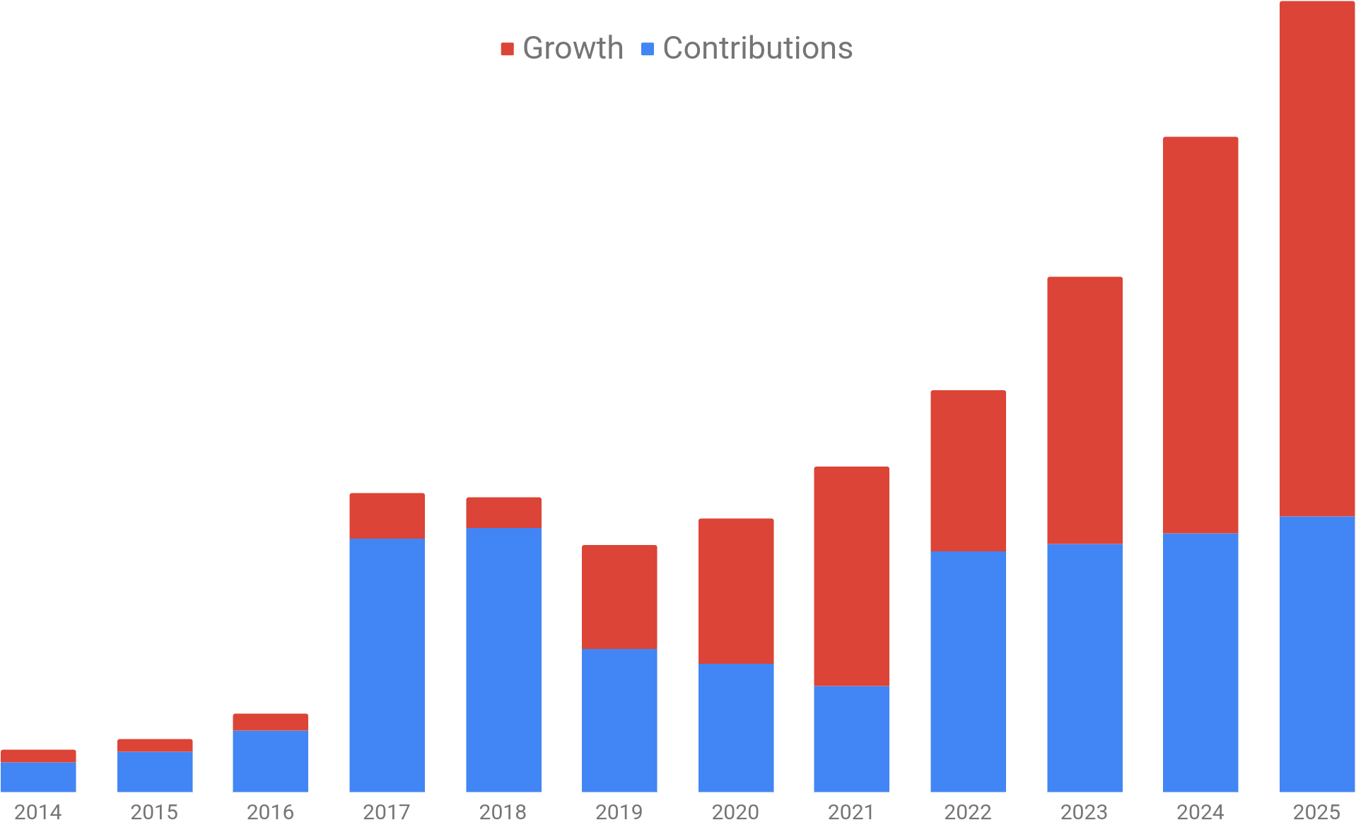
As an aside: for all of my harping on about negative numbers, I do realize that the running net contribution value will one day become negative, and so too may net growth, if/when we go through a sustained, multi-year market contraction, but the former should occur only after we’ve been living off these investments for many years, at which point I presume we’ll be far more focused on ensuring that our assets—whatever their source—outlive us (at least by a little bit) and not vice versa.
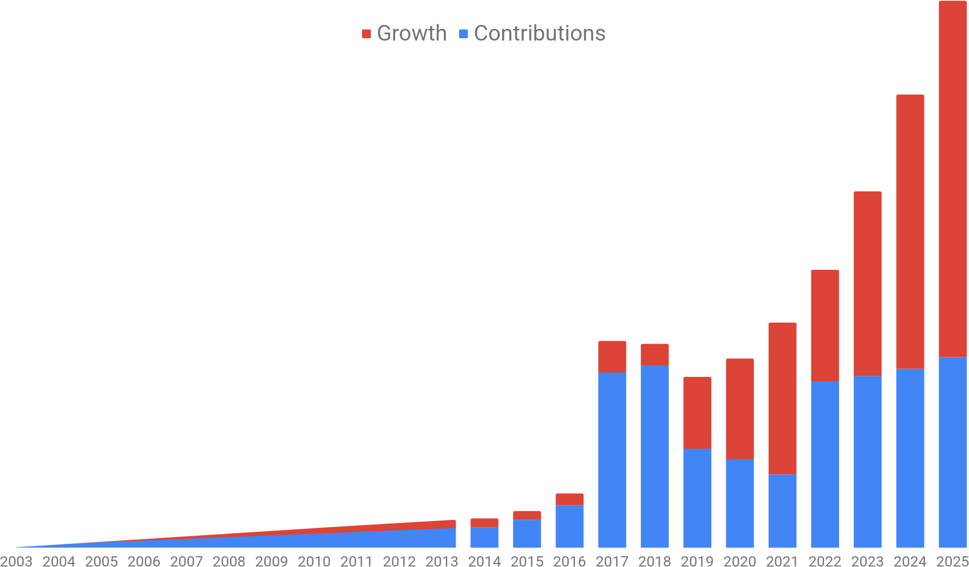
It’s worth emphasizing that our savings journey didn’t start in 2014 as the graph above might suggest—that’s simply as far back as I could access account statements. My journey actually started in June of 2004, when I transitioned from a student research assistant at my university to a bona fide employee of the state and was thus required to contribute a set percentage of my paycheck to the state retirement fund (which I later rolled over to my IRA). A few years after that, Stephanie made her first 401(k) contribution in September of 2008. Even though I’ve lost the precise details of the roller coaster that was 2004–2013, just plotting that “long head” as a straight line conveys the time and persistence required to save. To quote Morgan Housel, “If I can be average for an above-average period of time, that leads to a way above-average result.”
As I assumed might be the case a year ago, our savings strategy in 2025 turned out to be substantially similar to 2024. In short, we continue to prioritize maximizing the contributions to our tax-advantaged retirement accounts. At least as long as we’re able—we’re skating perilously close to the phase-out threshold for IRA deductibility, so we may soon lose some or all of that tax deduction. When that happens, we’ll redirect any surplus income to our brokerage accounts. One difference to note is that 2025 marked the first year since 2018 that we didn’t dip into our brokerage accounts to “make ends meet”; we’ll see if that holds true going forward. Otherwise, we have no big changes planned for 2026, but as always, anything could happen.