Justinsomnia on IE7
I feel sick even downloading IE7, but what the heck. Requires a 14.8MB download! Compare that to Firefox 2.0 RC3‘s mere 5.6MB. Watching IE7 install (verifying the genuineness of my copy of Windows, installing things all over the place, cranking away at the hard drive for minutes) feels something akin to getting raped by Microsoft. Thanks Redmond! (So glad I use Ubuntu at work.)
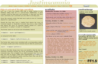
So I’ve taken a screenshot of Justinsomnia in Firefox 1.5 and 2.0 RC3, Internet Explorer 6 before installing IE7, and IE7. Click the links to see the results.
[FF1.5] [FF2.0RC3] [IE6] [IE7]


Amazingly there’s no difference between FF1.5 and FF2.0, which probably makes sense because Gecko’s CSS support has been excellent for a long time, and not much on my site really puts it through the paces.
Notice IE6 doesn’t obey the CSS selectors I use to remove margins and padding on paragraphs within posts. The good news is, IE7 does, and surprisingly without messing up my layout.
The only meaningful difference I notice between IE7 and the Firefoxen is the weird technicolor ClearType font-smoothing on the edges of text. I thought this was an OS-level feature, so there must be a way to activate it in Firefox (see update below), but either way, here’s how text looks blown up 1600% in Firefox 2.0:

And here’s how psychedelic it looks in IE7:

Update: I discovered that IE7 renders text with ClearType regardless of the OS setting, which you can turn on for Firefox (and all your other apps) if you like by right clicking on the desktop, selecting Properties > Appearance > Effects… and changing “Use the following method to smooth the edges of screen fonts” to ClearType. It definitely makes the text easier to read, in part because it’s bolder, but it looks kind of blurry to me (at first), and I sense the colors around the edges of letters as I type. As you can see in the Firefox screenshot above, I always have Standard font smoothing selected, which anti-aliases larger fonts in a monochromatic way.
So congrats, if you use IE, which I don’t recommend, and you upgrade to IE7, which I do, your experience reading Justinsomnia should be much improved. Internet Explorer users, welcome to the modern age.
This is your first tech post I have ever read and fully understood. I am heading to “properties” right now.
OMG- that trick made a HUGE difference! I said “Wow” out loud! Your text just got so much easier to read! Thanks!
Rock! Glad I could be of some assistance.
You can alter the ClearType setting in ie7 using the checkbox under the Multimedia section of the advanced tab in internet options.
I love the thumbnails. I may have to do this kind of visual comparison for my blog’s readers. that is if I still have Fx 1.5 installed on any of the three computers here, which I don’t think I have. An excellent article. I am glad to be able to link to it.