International Orange
 I really love the minimalist Golden Gate Transit logo you see on the buses and bus stop signs around here. It’s the simplest possible way to evoke the region: blue sea, green hills (at least in the winter and spring), and orange bridge. I wonder if the logo has a name, perhaps something like the tri-color swoosh or the Golden Gate figure-8?
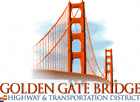
 Judging from their website, it seems that the Golden Gate Bridge Highway and Transportation District has been phasing the logo out in favor of one that leaves much less to the imagination. That’s too bad. All it really needs is the Web 2.0 treatment (think: gradients, reflections, drop shadows) for a new lease on life.
Oh what the heck, I couldn’t help myself. I even managed to add a fourth element: the fog.
 I discovered the other day that the color of the bridge is known as international orange, which was chosen because:
The HTML hex notation for international orange is #FF4F00. Neat.
You are spending too much time commuting!
[…] This is Justin’s version of the Golden Gate Transit logo. I find it an improvement on the already fine original, and way better than the new logo that the Transit Authority is phasing in. […]
Joy ha! Actually by car my commute is now in the 20 minute range (one way)—compared to 50-80 from Santa Rosa. By bus it’s under 40, with like an 11 block walk going the route I tried last night.
Andrew, I like the title of your post. The logo really looks good along side the Central Park Gates.
According to The Rough Guide to San Francisco & The Bay Area, when the GG Bridge was finished in ’37, its orange color was originally only intended as a temporary undercoat. But before the gray topcoat could be applied, “locals liked it” which is why it has remained orange ever since. Quite a happy accident since its iconic status owes so much to that color. BTW, it takes more than 5000 gallons of paint each year to keep it golden.
For future reference: How to Paint Anything the Color of the Golden Gate Bridge
Each color in the original logo actually means something. Green = Bus Division, Orange = Bridge Division and Blue = Ferry Division.
I work in the bus division and I too prefer the original logo. Nice work on tweaking the original!
Stephen, glad you enjoyed, feel free to forward this along to anyone you think might be interested.