The Great Purge
Consider this a sort of transparency report. As I mentioned in my recent Responsive Redesign post:
Though I’ve long been a staunch proponent of not self-censoring old content, I may start “unpublishing” some old posts that I feel have little or no redeeming value, besides being cringe-worthy indicators of where I was at the time.
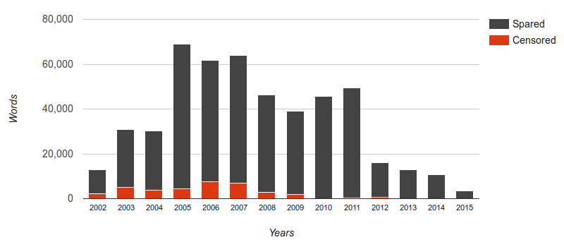
This was a massive undertaking, that involved twice going through each and every one of the 2,088 posts I’ve published over the last 13 years (many of which I reread) and asking myself, Is this something I’m proud of? In the end, I answered No to 277 posts. The vast majority were culled from my early years of blogging. It’s hard to categorize the subject matter which most often fell under the knife, except to say that many of my old political or complainy rants had not aged well.
I’m redirecting all of the unpublished posts to this one, for the sake of continuity. So if you were looking for something else and did not expect to end up here, hopefully the explanation above suffices. However, the content all still exists, so if it’s imperative for anyone to have access to one of my old posts (for research, for curiosity, etc.), simply send me an email explaining what you’re looking for and why.
In recent years, I’ve grown far more selective in what I post, focusing primarily on sharing stories and photos from my various adventures. This has also meant posting far less frequently, but with a much higher standard of quality. It came as little surprise that I unpublished very few posts after 2009 and nothing after 2012. Besides the graph demonstrating the rise and fall of personal blogging, it was also surprising to discover that in total, I’ve written almost 500,000 words here over those 13 years (of which I’ve now deducted nearly 36,000).