I was looking at my cell phone bill online this evening, and saw that Sprint keeps an archive of my bills that go back two years. So I thought it’d be cool to see how my usage has fared over time (and maybe inform my future choice of calling plans).
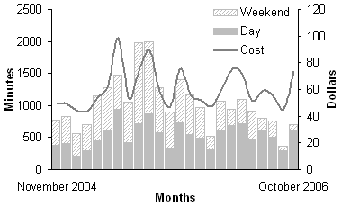
After some trouble manually harvesting the data*, I plotted it to show my daytime and off-peak (nights and weekends) usage compared to my monthly bill.
Over this time period, I’ve used Sprint’s “fair” and flexible plan, which gives me a moderate number of daytime minutes to use a month (originally it was 300, currently it’s 400). Above that, time gets portioned out in blocks (originally it was 100 minutes for $10, right now it’s 50 minutes for $5). I used to pay $5/month so my nights and weekend minutes started 2 hours earlier (at 7pm), now that should be free, but I can’t tell if that’s the case on my recent bills.
Thus the solid gray bar is the primary determinant of price, which averages to about $60/month. That’s total includes everything, the monthly charge ($36), taxes (~$10), a dollar or two for text messages, and then those oh-so-flexible charges ($0-25).
On average I’ve used a little over 1000 minutes a month, split pretty evenly between daytime and nights and weekends, though my usage appears to be trending downwards. Still $60/month is a lot of money, frankly I’d rather it were a flat $30 monthly fee. Currently the next most expensive plan comes with 900 anytime minutes, but the base price? $60.
The graph itself tells a story. The first peak, and my most expensive bill at $98, is May 2005, the month during which I drove from North Carolina to California, and spent a lot of time on the phone as I went. June is surprisingly quiet (new job), and then I’m on the phone for almost 2000 minutes July and August, keeping in touch with friends in North Carolina and planning a trip back in early September. Three months later I met Stephanie in November. The second to the last month (September 2006) shows another big drop in usage right after we moved to the city.
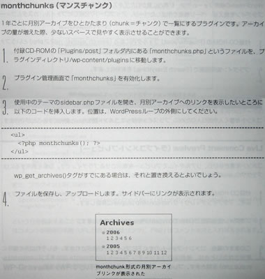
Naoko McCracken, a web developer up in Michigan recently wrote a book on WordPress in Japanese entitled WordPress 標準ガイドブック (Standard Guidebook). She contacted me back in September to say that she’d included my popular (and very first) WordPress plugin, Monthchunks, in the book and its accompanying CD.
Two months later, she sent out another email to let folks know that she’d gotten a few advance copies. Since she didn’t have enough for everyone whose code she referenced, we had a challenge: guess how many screenshots she used in the book. Those who came the closest would get a book. I guessed 270—Amazon.co.jp said there were 343 pages, so I figured slightly more than 75% had screenshots. The correct answer: 295.
A few days ago I got a package in the mail.
It’s really cool, the cover’s very fancy (shiny) and the book is entirely Japanese except for occasional English words used in paths/URLs and proper nouns which I guess are not easily translatable.
Here’s a peek inside (of the part describing monthchunks):
Jonathan Miller, CEO of AOL, introduces Lou Reed last night, calling him a poet, a writer, a musician, and the person who introduced him to his kung-fu mentor. What the?
So Lou Reed gets on stage with two accompanying musicians, flanked by large video screens zoomed in directly on his weathered face. He begins playing a song to the buttoned down and sitting down Web 2.0 crowd. Meanwhile there’s an audible drone of people talking in the back of the large room.
Between songs Lou looks pissed, but I think that’s normal. He tells the crowd, “You can keep on talking, I’ve only got 20 minutes. Or I can turn up the music. I can turn it up so loud it will hurt. Do you want me to turn it up? Do you want me to make it hurt?” (rough paraphrase). How awkward.
He’s met with some faint cheering/clapping to turn it up, so over the mic to his sound guy, he growls, “Frank turn it up!” Frank probably thought he was joking. Lou repeats himself once or twice: “Frank, turn it up, Frank turn up the sound!”
The sound gets cranked up, the conversation in the back of the room gets drowned out (or stops). A sense of shock travels through the audience. Shit, we pissed off Lou! People are still sitting. Except for one Tim O’Reilly, who gets up and does his signature West County snake-charmer dance across the auditorium.
By the time he makes his way across the whole room, he’s in front of me and Melanie, so I figure, what the heck, he’s got balls, I might as well stand up. Melanie follows suit, but we’re the only two people standing, clapping, as Tim bounces around the room.
By the time the song ends, the attendees, who are either impressed by Tim’s gall, or Lou’s, finally get off their feet for the rest of the performance, including the song “Sweet Jane.”
At one point Lou muses on his predicament: “Who would have thought it would come to this. I’d be playing at a cyberspace conference, brought here by AOL, introduced by my kung-fu brother.”
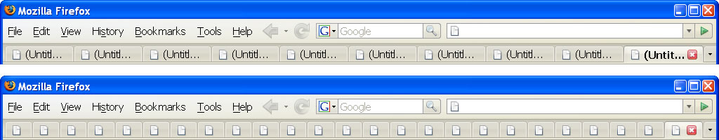
According to the new Firefox 2 defaults, I am guilty of opening too many tabs. At an average window width of 1024px (though I’m usually browsing at around 1200px) you can only open 10 tabs with the newly enforced tabMinWidth of 100px.
I don’t know about you, but I use tabs as visible history. New thoughts, new searches, new links all get opened up in new tabs. That way they’re always easily accessible for future browsing or reference later. Heavy emphasis on easily.
With Bloglines alone I might skim 60 new posts and open 15-20 at a time to read or comment on further. I’m sure I can’t be alone on this one. Hiding the new tabs makes my active browsing history (and future reading) invisible and less accessible—let alone eliminating the feedback of a successful Ctrl+click.
I don’t believe that people navigate tabs by the first 8-12 characters visible from the page’s title. We navigate primarily based on the favicon and the tab’s location on the tab bar. Tabs on the left are more recent, more frequently used (Gmail, Bloglines, my blog, etc), more important, and tabs on the right are newer, less important, set aside for future browsing. The tab bar represents a browsing timeline.
Solving the problem of too many tabs by conveniently hiding them out of view is no solution at all—especially considering that tabs are traditionally the territory of power users. Hiding them neuters their power. Here’s the thing that gets me: the problem of too many tabs already had a solution: closing tabs!
Once there are too many tabs to keep track of, Ctrl+w is the excessive tabber’s best friend. You’d think that adding a close button to each tab would suffice for the average user.
How to fix this? Type about:config in your Location bar, search for tabMinWidth. Double click on the browser.tabs.tabMinWidth entry and change the value from 100 to 15. At a window width of 1024 you’ll be able to comfortably fit 25 tabs (with only favicons visible), which pretty closely resembles the pre-FF2 behavior.
The Firefox 2 tab bar, before and after tabMinWidth modification
At Federated Media, any individual can buy ads on any of our 80+ sites. When they submit their creative, it’s very likely it’ll be animated. There’s probably no doubt that animated ads are more effective at attracting attention than their static counterparts, but that’s also what makes them so annoying.
To strike a balance—respecting our authors and their audiences above all else—we require that any animation lasts no longer than 15 seconds.
The only problem is, we had no way to enforce this. So Andre, who first built FM’s platform, would watch every banner ad for at least 15 seconds to make sure it stopped animating. A nefarious ad designer could have successfully gotten past the Andre-check by animating the banner for 12 seconds, pausing it for 20 seconds, and then repeating continuously. What usually happens though is that someone submits a banner with animation that lasts for about 2-3 seconds, pauses for 3, and then repeats continuously.
Whenever an ad like this was submitted, we’d have to email the person who submitted it, ask if they could resubmit an ad with animation that stops after 15 seconds, etc etc etc. It was a really manual process.
So earlier this week I set out to see if there was an easy way to probe a GIF file programmatically to determine whether or not it was configured to loop continuously. PHP doesn’t do this natively, and I couldn’t find anything on Google that even came close to analyzing a GIF’s animation metadata—in any language.
So, I decided to write my own.
With a hex editor in one hand and the GIF 89a standard in the other, I set about understanding the image format and the Netscape 2.0 Application Extension (below) that added the option to loop the animation continuously (or for a specific number of iterations):
byte   1       : 33 (hex 0x21) GIF Extension code
byte   2       : 255 (hex 0xFF) Application Extension Label
byte   3       : 11 (hex (0x0B) Length of Application Block
                 (eleven bytes of data to follow)
bytes  4 to 11 : "NETSCAPE"
bytes 12 to 14 : "2.0"
byte  15       : 3 (hex 0x03) Length of Data Sub-Block
                 (three bytes of data to follow)
byte  16       : 1 (hex 0x01)
bytes 17 to 18 : 0 to 65535, an unsigned integer in
                 lo-hi byte format. This indicate the
                 number of iterations the loop should
                 be executed.
bytes 19       : 0 (hex 0x00) a Data Sub-block Terminator.
In the end, I didn’t write a complete GIF parser, but opted for a simple regular expression probe of the GIF file. Bonus: figuring out how to convert little-endian unsigned ints from hexadecimal to decimal.
So far I’ve tested the code on some pretty long GIF animations, and it seems accurate. So if you need to find the duration of a GIF animation and/or the number of times it loops, here’s the code to do so in PHP—which should be pretty easily translated into just about any other language.