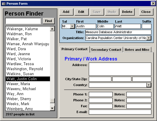
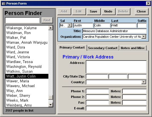
State Transition Diagram for the CRUUD model
Having designed and redesigned countless user-interfaces, some for the web, and many using Microsoft Access, I’ve started more religiously employing the CRUD model, which stands for “Create, Retrieve/Read, Update, and Delete”. These are the four major functions a user-interface–especially one the interacts with a database–must perform.
Most users now expect fairly robust “undo” functionality, therefore I’ve added a fifth function to the paradigm, “undo”, giving birth to a new acronym: CRUUD (pronounced /crude/). The undo action provides an important alternative to the update action.

The diagram above is my present vision of how a professional user-interface should respond to user-interaction. The blue rectangles are the two main states, and in many cases are the same user-interface. The pink rounded rectangles represent the user-triggered events (usually implemented as buttons). The logic that the system performs in response to those events are captured in the diamonds and parallelograms. Below I’ve included two screenshots of a user-interface in both of the two states.

