How to retouch photos
These are actually the steps I go through before posting a photo to my blog. I’m always curious how other people edit their photos, so I hope you find this enjoyable and/or informative.
Rotate the image, if necessary. Occasionally my horizons are off ±1.5° (small but noticeable).
Minimally crop out any undesirable peripheral elements, if necessary.
Resize to a minimum width (or height). On my blog most of the photos I publish are only 380 pixels wide. When you have a choice of resizing algorithms, choose cubic or bicubic.
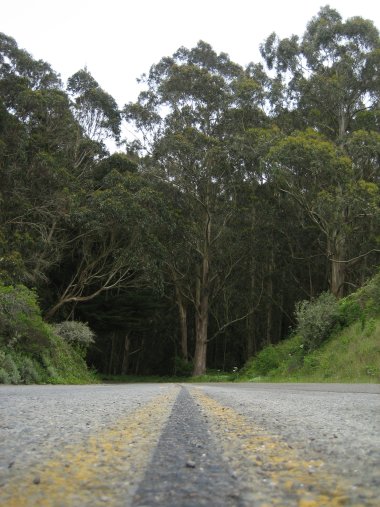
Choose an aspect ratio for the photo. The native aspect ratio of most cameras is 4:3. Lately I’ve been playing with square compositions (1:1), but I’m usually a fan of a golden ratio (~1.618:1) for a more panoramic feel. For a widescreen feel, go with 16:9.
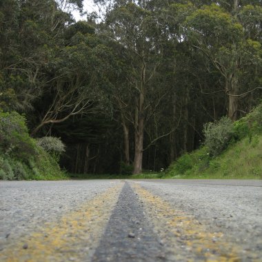
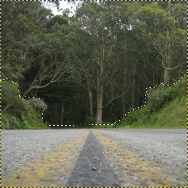
Balance the colors. If any parts of the photo are especially dark (foliage and landscape on a bright day) or light (pavement or sky on a bright day), I selectively choose the area I want to lighten or darken and adjust the color balance (without preserving luminosity).
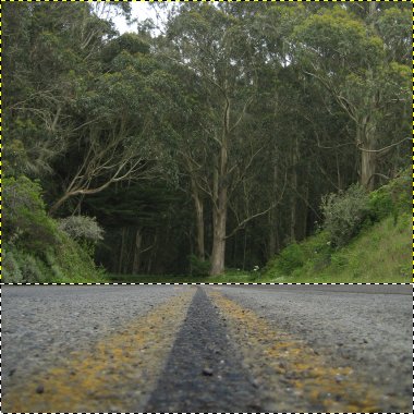
Adjust contrast. I like my photos contrasty, and I find most unedited digital images to be a little gray.

Adjust saturation. I like my photos saturated, especially if they have a variety of colors. Blue skies look bluer, greenery looks greener, yellows and reds look more vibrant.
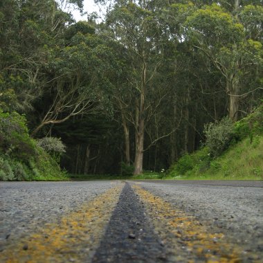
Apply unsharp mask. This is a fancy way to sharpen a photo, essentially increasing the contrast between color boundaries so they look more in focus to the human eye.

Voila, there you have it. The finished product. I did all of the above in The Gimp, a free and open source photo editing tool, similar to Photoshop, but available on Windows, Mac, and Linux. However, all that I’ve described above should be possible with Photoshop or Fireworks. I’m always learning (discovering) new tricks.
Since it’s a hard even for me to see the changes I’ve made when the photos are stacked on top of each other, I built a little slideshow so you can see the changes yourself.
Steps: [1] [2] [3] [4] [5] [6]
 Click between [1] and [6] to see a dramatic transition.
Update: check out my Web Photo Editor extension for The Gimp which performs all these steps in on fell swoop.
Cool before/after. Thanks for commenting on my photo. It means more now that I know some of your trade secrets. :)