user-interface problem
i am trying to design an interface to browse a list of trainings.
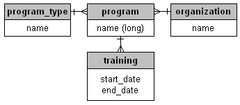
each training belongs to a program, and a program has a hosting organization (like university of costa rica), a program type (like master’s degree or workshop) and a name which is usually really long and hard to differentiate from the other program names (like “evaluating the impact of population, health and nutrition programs”)
finally each program can have one or more training instances which are differentiated from each other by their start and end dates.
for the entity-relationship diagram aware, this looks like:

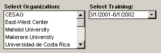
i am implementing this in Microsoft Access, which means the only ‘widgets’ i have to browse this information are listboxes and comboboxes:

(since radiobuttons, checkboxes, and togglebuttons must be placed on the form in advance for each option, like for each program type, they are not as useful for browsing)
some problems with these widgets:
– once you place the widget in the form, you can’t programmatically change its shape or size or position depending on the amount of data in the list
– names longer than the width of the list do not wrap
– listboxes are effective for browsing, but unlike web-based user-interfaces which can scroll for many pages, in Access the entire user interface form should be visible to the user without scrolling